See One Room in Ten Colour Palettes
HomeGlow's Colorways tool renders one room photo in ten tailored colour palettes so you can compare schemes side by side. Upload the room, look at all ten, then choose the palette you want to take further.
Last updated 26 October 2026
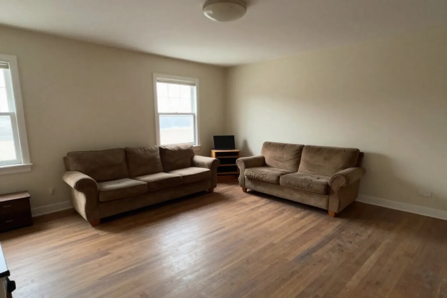
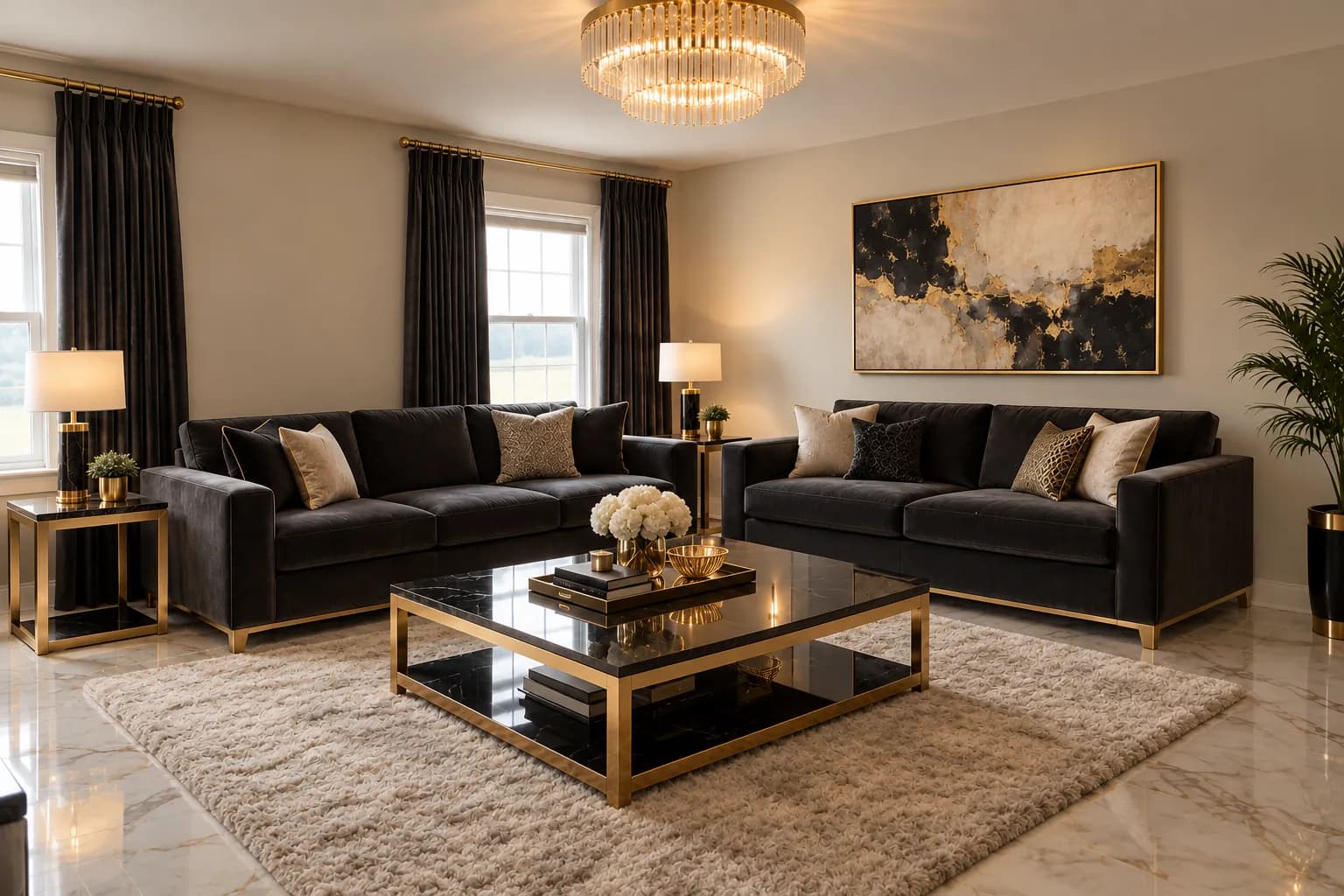
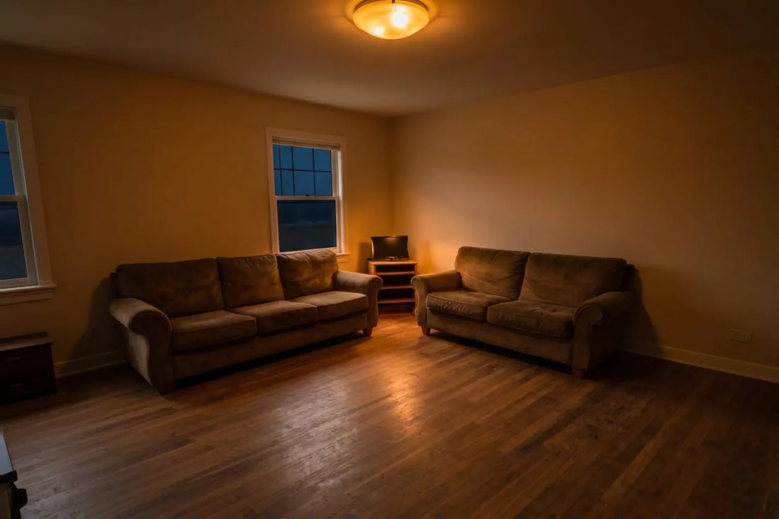
Same room, a bolder palette. The same living room before and after a bold restyle. It shows how far colour and mood can move on one set of walls; a real Colorways result is just below.
How it works.
Add a photo of the room
One photo is enough. Colour changes read best in even light.
Run Colorways (PRO)
The tool returns ten palette previews of your room at once, each with a name. Colorways costs more credits than the free tier includes, so it needs PRO.
Pick one to take further
Choose the palette you like and open it as a full render. Rendering a palette at full quality is part of PRO.
What a palette swap looks like.
A living room in deep teal, with a camel sofa and rust cushions: the kind of palette Colorways shows you.
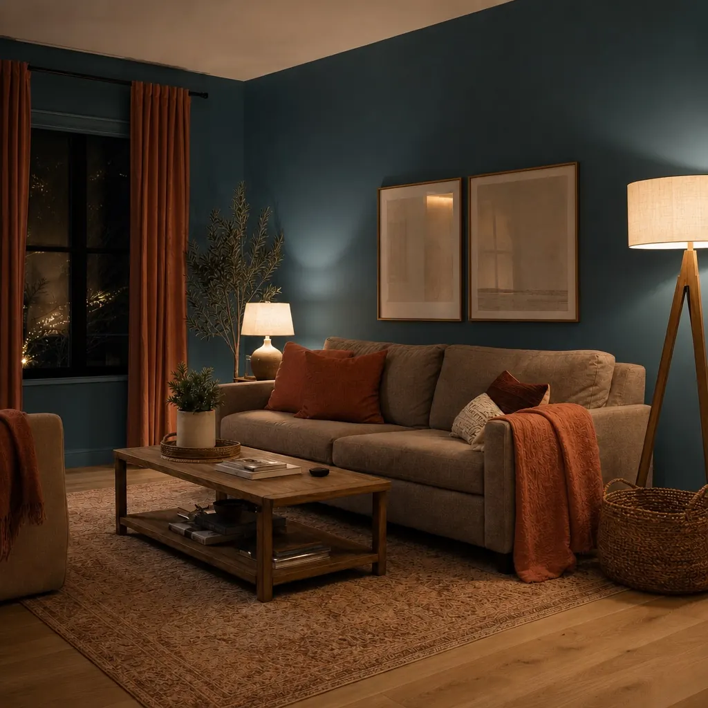
Illustrative image of a Colorways-style palette swap, made with HomeGlow's image tools rather than by running Colorways itself.
Why compare ten at once.
Choosing a colour in isolation is hard because you cannot see what you are rejecting. Ten palettes of the same room make the differences obvious: calm against bold, warm against cool, light against deep. The images below show the same living room restyled several ways, which is how different the same space can feel. These are style redesigns, not Colorways runs.
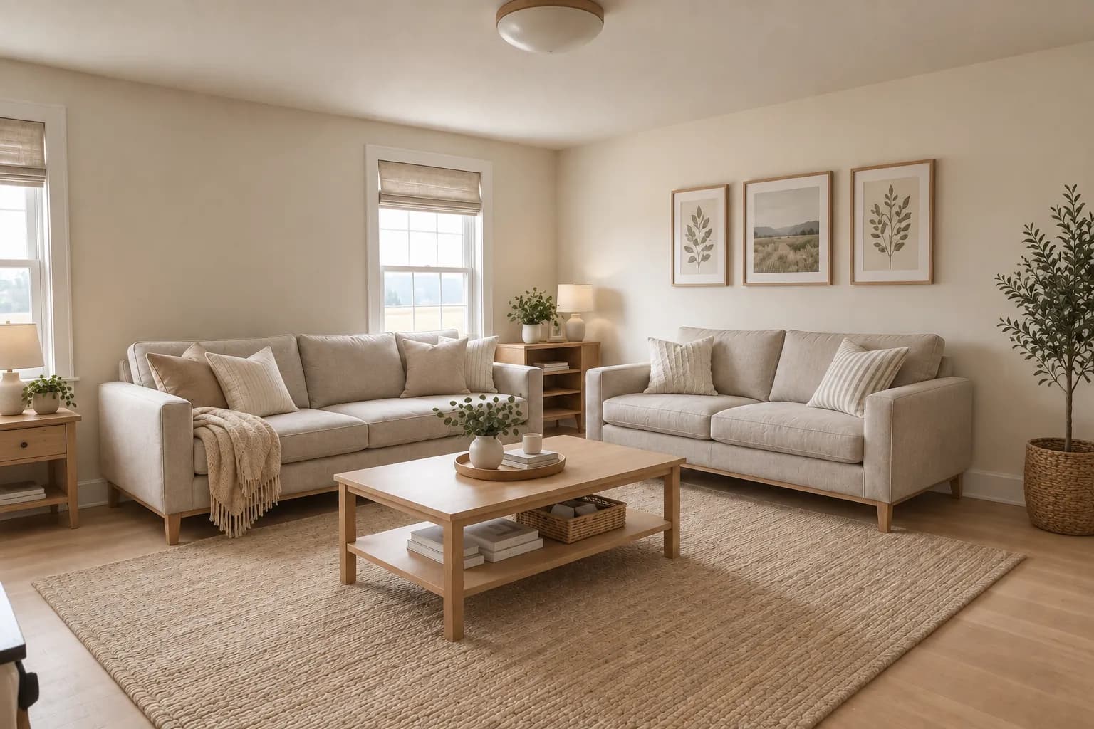
Scandinavian. Pale, soft and low-contrast.
Modern luxe. Deep, dramatic and warm metallic accents.
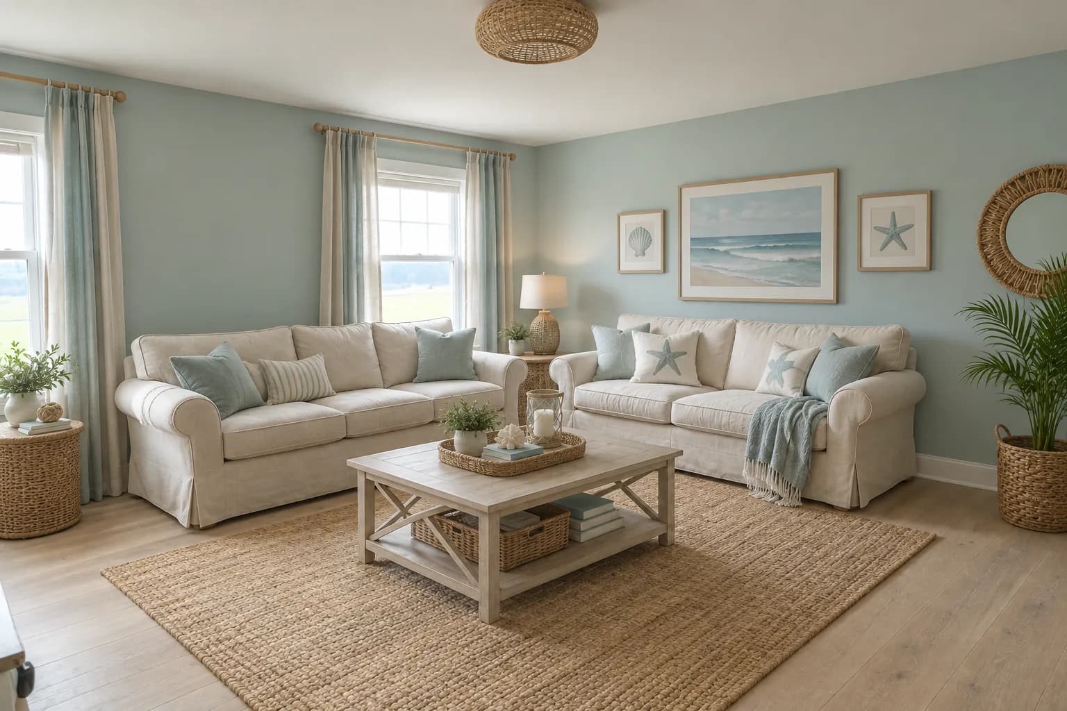
Coastal. Cool, airy and light.
How to choose a colour scheme.
The 60-30-10 rule
A common guide: about 60 percent of the room in a dominant colour, 30 percent in a secondary one and 10 percent in an accent. Use it to read a palette, not to obey it.
How many colours
Three to five including neutrals is a comfortable range. More than that tends to feel busy in a small room.
Warm or cool
Warm palettes feel cosy and close; cool ones feel airy and calm. North-facing rooms often look cooler, so many people lean warm there.
Colours that go with grey
Warm whites, soft greens and blues, clay and brass. Compare two or three on your own photo.
What it will not do.
- Results are AI-generated concept images. They are not structurally accurate, to scale or code-checked, and they do not replace an architect, structural engineer or contractor.
- The ten previews are for comparing schemes. Colours on screens are approximate, so test a physical sample before you paint.
- Taking a palette to a full-quality render is part of PRO.
Browse real HomeGlow redesigns.
Questions.
How do I choose a colour scheme for a room?
Start from what stays, such as the floor and large furniture, then compare several palettes on your own photo. Colorways shows ten at once.
What is the 60-30-10 rule?
A guide for balancing colour: roughly 60 percent a dominant colour, 30 percent a secondary colour and 10 percent an accent.
Which colours go with grey?
Warm whites, soft green and blue, clay and brass are common partners. Preview a few on your room.
How many colours in a room?
Three to five including neutrals is a comfortable range for most rooms.
Warm or cool palette?
Warm for cosy, cool for airy. The ten palettes let you see both on your actual room.
Can I test palettes on my room?
Yes. Upload a photo and Colorways returns ten palette previews of it.
More from this guide.
Plans and allowances are on the pricing page. Questions? Write to us.
See your own room first.
Free to try on a photo of your room. No card needed to start.
See my room in ten palettes